
There is a famous paperback called “The Elements of Style” by Strunk and White. Many writers treasure it as a guide to writing clearly and succinctly while avoiding common grammatical errors. The handbook itself is a model of clarity.
I had 26 years of studio work and art classes behind me as a fine arts painter when I gave up in disgust at the ploys involved in marketing art. In comparison with the world of galleries and critics, what contractors asked me to produce on floors came as a refreshing whiff of common sense.
Fifteen years later, I decided to teach some principles of design and composition to my contractor-students. Having some knowledge of the way artists think about filling space truly helps in choosing materials and structure. Therefore, I undertake this series of articles to present the Elements of Style for Contractors.
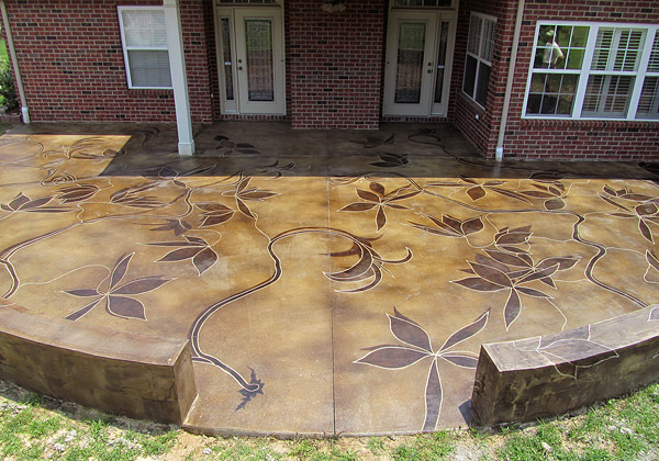
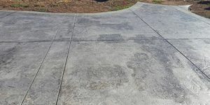
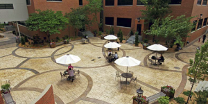
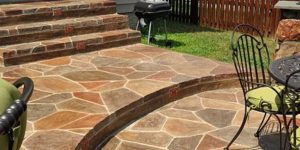
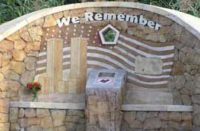
Here is a riddle for you: What feature do the three concrete designs on this page have in common?
Short answer: They are all good examples of a balanced design that doesn’t rely on formal symmetry to achieve it. In other words, being asymmetrical, they are rarities in our concrete world.
Now, I’d like to address what artists call “composition”— and I don’t mean the ratio of water and sand in our concrete mixes. I mean space division. It all has to do with perceived weight and balance, and it can get a bit subjective.
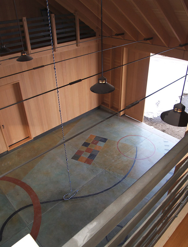
will use some diagrams I made by gluing down pieces of black construction paper to a gray background. I recommend this exercise as an entertaining way to flex your design muscles. These are adapted from “A Design Manual,” Shirley J. Brainard’s 1991 Prentice Hall paperback. I had been drawing and painting for 20 years before I picked up this book. My art teachers talked about composition from the beginning, of course, but this book pulled it together in a very clear way. (A quick search of Amazon shows there are several low-cost, used versions of the fourth edition.)
 |
 |
 |
 |
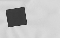
Formal symmetry
As Westerners we read from left to right. An implied central axis divides the space in half. By placing the black square on the left we create an imbalance. We feel a need to distribute shapes in our design so that the apparent visual weight seems more balanced. Here is one way of doing that.
Many people create instant balance by placing a bilaterally symmetrical shape smack in the middle of the canvas. Brainard calls this “formal balance,” but I prefer to use “formal symmetry.” As Brainard says “formal balance is instantly understood as it requires little of the viewer. It is exacting, non-casual and quiet, but can also be boring.”
 |
 |
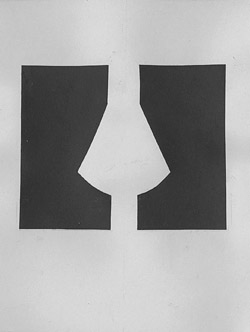
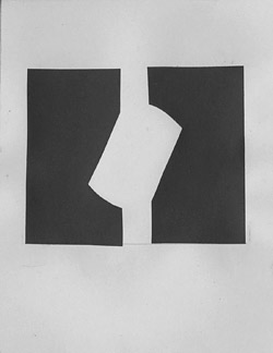
Approximate symmetry
However, an interesting thing happens if we flip the shape on the right upside down and place it next to the shape on the left. Now we have an equally balanced and centered design — an approximate symmetry — but it has an unexpected difference and is more dynamic.
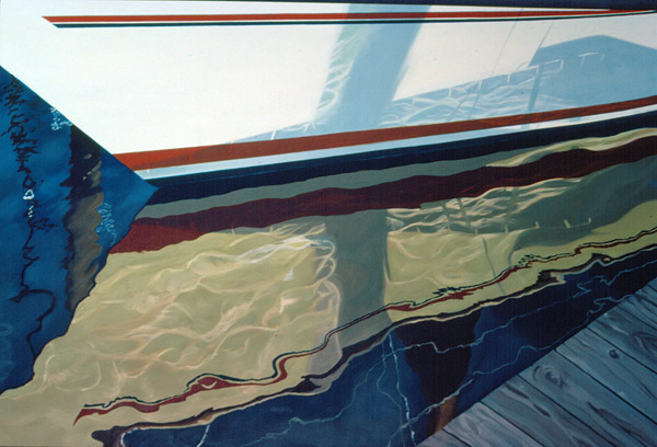
Looking at my paintings from 30 years ago, I realize I love approximate symmetry. I’ve been using it in my compositions for years, as in this sailboat hull I painted from a photograph taken in Seabrook, Texas.
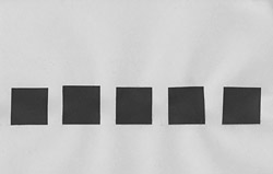
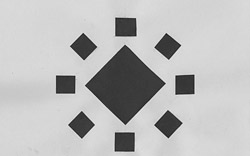
Another kind of balance Brainard refers to is radial balance. “Radial balance is suggested by shapes arranged around a center or ‘radius.’ The weight of the smaller shapes is collective,” she writes. Many Native American pots and baskets feature radial symmetry as the arrangement is useful when the ‘canvas’ is a circle. This solution is a favorite with architects and floor designers.
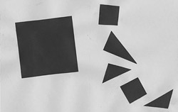
Asymmetrical and balanced
The hardest thing to do is to design something which is asymmetrical and yet in balance. Here is where design becomes somewhat subjective. While I feel the cascade of small shapes on the right are balanced, someone else might prefer a different arrangement.
Few concrete artisans bypass formal symmetry in their floor designs, but Michael Miller, the concretist, does. He used dyes and hand-brushed floral designs on floors of several Nugget Market stores on the West Coast that resemble large Impressionist paintings. (See Concrete Decor, November/December 2010, page 18). Even more unusual is the abstract design he did on the Bunce residence floor featured earlier in this article. His inspiration was some art he saw on the client’s walls and got their OK to do something similar in their modern home’s entryway.
The April 2012 issue of Concrete Decor highlights a patio floor and sitting wall covered with leafing vines and shadows done by Rick Lobdell of Concrete Mystique Engraving in Nashville, Tennessee. Also inspired by art in the client’s home, the design is nicely balanced yet is not a set pattern of mirror images. Each vine was freehand drawn into the concrete with an angle grinder. Lobdell has the advantage of working with a friend, Joe Drake, who is excellent at placing new concrete that blends with an existing slab to create a seamless canvas.
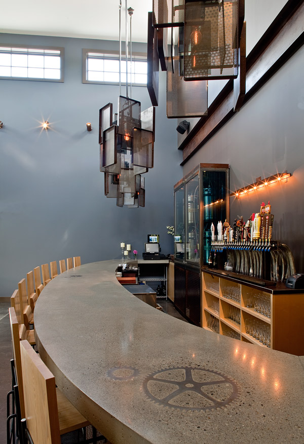
Michael Littlefield, of Custom Concrete Designs in North Berwick, Maine, formed a new bar at a pizzeria in Maine where every new element had to be finished to look like it had been there all along. (Concrete Decor, January 2012, page 56). The owners provided him with a few large gears to inlay into the bar, but they were not all the same size, which precluded formal symmetry.
As an artist, I am a proponent of asymmetrical design, but I must admit I have rarely executed one in 20 years of floor staining! I don’t tend to think in terms of discrete geometrical shapes or lifelike plant forms. My goal is to mix two or three colors on a floor to create natural-looking shapes like those found in agates or other rocks, so that the composition is evenly random. I expect we will see more daring design feats, as we educate ourselves and our clients about balance and the varieties of symmetry available to us.