

Concrete Decor asked a trio of art instructors from Southern Arkansas University to share their perspectives on concrete, color and texture.
First of all, the irregular highs and lows of a texture can make it hard to determine a “true color,” says Southern Arkansas University assistant professor of art Dan May. When you drive through a mountain canyon when the sun is low, he says, you may notice an overall blue tinting on the trees and rock surfaces caused by shadows, which are usually tinted blue.
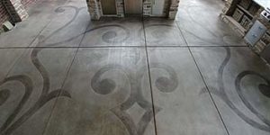
“A concrete surface is like these canyons in miniature form,” May says. “When comparisons were made in side-by-side studies of the same color on smooth surfaces and rough surfaces, researchers found the colors on the rough surfaces look darker and somewhat bluer.”
Steven Ochs, Southern Arkansas University professor of art and owner of Public Art Walks, likes to make the most of textured rough surfaces by applying highly transparent water-based stains. “With just one color, you can achieve an entire range of value between light and dark,” he says. “When the color ‘breaks’ over the raised areas, it will be light, and when it puddles or ‘pools’ in the recessed areas, it becomes darker.” This creates an illusion of depth.
With opaque colors, the more layers you apply, the flatter and more uniform the textures appear, he says.
If you use a nonskid safety texture such as alumina oxide or a polyresin sand to meet code for static coefficient of friction, you may see an accurate color from one angle and a sugarlike sheen from another, Ochs says. One way to soften the glare is to use varied sizes of aggregate between layers of sealer. “The more refraction you have (bending light rays), the softer the shine,” he says.
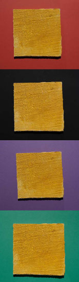
Some artists juxtapose complementary colors and different light sources to bounce light from one color source to another before it travels to the eye. By using these tinting effects, you can create a “false texture,” May says.
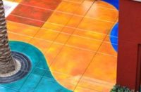
The juxtaposition of warm colors – reds, oranges and yellows – with cooler colors – blues and some purples – plays tricks on our vision. “The warmer colors appear to move toward us, and the cooler ones recede,” May says. This creates the illusion of distance separating them and can also create texture of sorts.
“Complementary colors such as green/red or orange/blue appear much more intense when placed side by side,” says Southern Arkansas University instructor of art Ann Bittick. If you stare at these colors too long, your eyes become fatigued, and when you look away, you’ll see opposite colors.
Complicating matters, May says, the two genders see colors differently. Men have larger rods in their eyes and women have more cones, he says. Rods account for the ability to detect movement, and experts in human anatomy and anthropology have reasoned that men evolved as hunter-gatherers who had to detect movement in dark places or in low light as they hunted nocturnal prey. “Therefore,” May says, “men are more aware of values of gray and contrast.”
Women, on the other hand, relied on their vision to differentiate colors when searching for small edible objects, such as berries. “Their ocular faculties evolved to be more in tune to color variations,” May says. “So when you need to know the color of a poisonous bug, ask a woman. If you need to know if you are in danger of being run over by a Volkswagen bug, ask a man.”