 There is a famous paperback called “The Elements of Style” by Strunk and White. Many writers treasure it as a guide to writing clearly and succinctly while avoiding common grammatical errors. The handbook itself is a model of clarity.
I had 26 years of studio work and art classes behind me as a fine arts painter when I gave up in disgust at the ploys involved in marketing art. In comparison with the world of galleries and critics, what contractors asked me to produce on floors came as a refreshing whiff of common sense.
Fifteen years later, I decided to teach some principles of design and composition to my contractor-students. Having some knowledge of the way artists think about filling space truly helps in choosing materials and structure. Therefore, I undertake this series of articles to present The Elements of Style for Contractors.
Last issue I wrote about the color value scale, from white to black. This time the topic is color mixing and useful color combinations. For those of you who use dyes on floors, a working knowledge of the artist’s color wheel will heighten the impact of your work. You may learn some color-mixing tricks which will save time and may rescue you if you run out of a shade and need to mix it from alternative colors.
Any given color has three aspects: hue (or chroma), value (the degree of darkness or lightness of the color) and saturation (the intensity or purity of the hue). As with many parts of your craft, the best way to understand color is hands-on, by building your own color wheel. (See sidebar.) This shouldn’t be done as a mental exercise. The changes to colors as you mix them really need to be seen to be believed. I’ve been mixing colors for 40 years, and it still astounds me how a tiny dab of red can change the color of a large pool of green.
Complementary colors
Here is a typical color wheel for use as a guide. This comes from Johannes Itten’s book “The Elements of Color,” although I have altered it. Itten, a famous art instructor and painter at the Bauhaus, developed more theories and color exercises than anyone else in the 1920s and ’30s. My instructions make a slightly different color wheel, since the blues and violets alter when mixed with paint, as opposed to printer’s inks. My instructions will make a sturdy color wheel that you can laminate and carry to any jobsite, so that your crew can begin to learn color mixing as well.
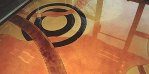
Now, referencing your color wheel, let’s talk about some important color schemes.The most eye-catching combinations involve colors directly opposite on the color wheel, such as red and green. These are called “complementary colors.” If the values of the complements are the same and they are placed side-by-side, the contrast is so intense that the line between them seems to jump.
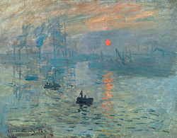
If you place a large amount of green around some dabs of red, it heightens red’s impact. This is called “simultaneous contrast.” If Claude Monet painted a yellow flowering tree, he would make its shadow a shade of violet, employing simultaneous contrast to intensify the yellows nearby.
Impressionist painters noticed when they placed dabs of pure color on a canvas, the viewer’s eye would blend some colors from a distance and perceive others as standing out from the picture plane. As a rule, cool colors recede (good to know when painting distant mountains), while warm colors like red and orange advance. Monet used the complements red-orange and blue-green in this early painting, below, which gave the Impressionist movement its name. He added some white to all of the colors, which is called tinting. (If he had added black or gray he would have made “shades” of the same colors). He kept the values of both hues about equal, so that they vibrate against each other.
The most interesting thing about complementary colors is that if mixed together, they always make brown or gray. As you know from working on floors, there are at least 30 different varieties of brown that can occur with stains and dyes. If you are mixing dyes and your brown looks too “cool” (i.e. too blue), don’t add a different brown. Just add a small amount of blue’s complement, orange, to quickly neutralize it.
These color mixing rules do not apply to acid stains, since acid stains create color by chemically reacting with the concrete mix. The color mixing I’m referring to pertains only to dyes or pigments.
The way we perceive color is based on the rods and cones in our eyes. If you stare at one intense color for a few seconds and then close your eyes, the after-image you see will be that color’s complement. That is how these color-mixing “laws” arose.
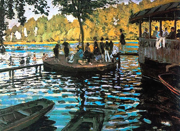
This painting by Monet, above, done three years before Impression, Sunrise, has larger strokes and “split complementaries,” yellow-orange and its two opposites, blue and violet. Whereas I’ve only seen reproductions of this painting, I’m certain the darkest shadows in the water were done with deep violet mixed from pure blue and red and not black pigment. Black from the tube would have ruined the effect. Impressionists all played with color and shared the results of their experiments with each other. They wanted to create intensity and motion, which this little painting does to perfection.
Analogous colors
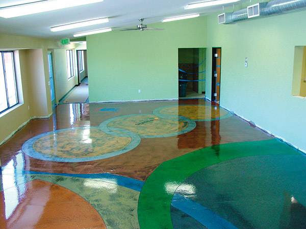
A very popular color scheme for floors involves “analogous colors,” defined as any three colors in a row on the wheel — for example, the secondary green, with its neighbors, yellow-green and blue-green. This illustration is from an article on toppings in Concrete Decor February 2007, page 39. The artisan who did this floor wisely used brown to enhance the array of greens — a warm brown which incorporates the red-orange complement to his green.
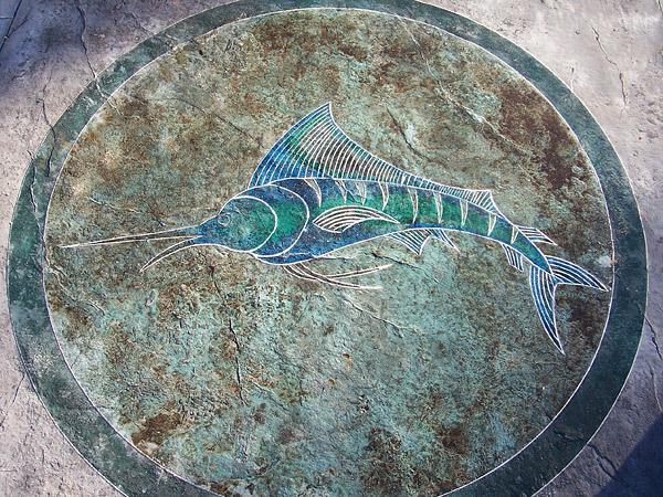
A more subdued example of analogous colors is found in a sailfish design done by Specialty Concrete Products in Concrete Decor May 2009. Acid stains lend themselves naturally to analogous color schemes. In fact, if true complements are wanted on the same stained floor, the area of a complement usually needs to be masked off and dyed later.
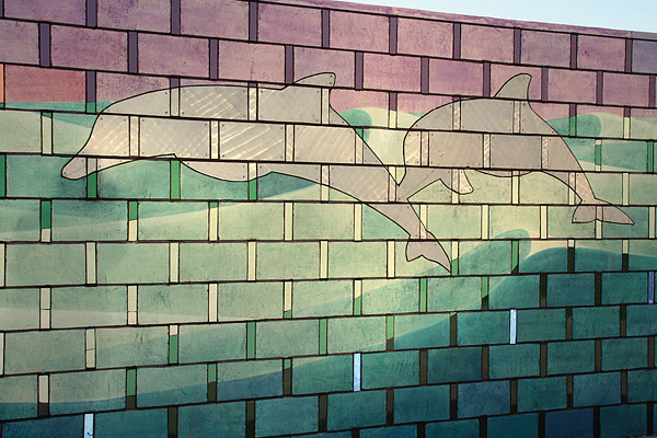
Below is a long wall mural done in complementary colors by Dakota Warren in Compton, California, which appeared in Concrete Decor September/October 2009. Warren stained the wall with Deso Dyes from Colormaker Floors. The cavorting dolphins are so neutral, they seem to disappear between the red and green waves.
In the next article, I’ll address more color effects, including some strange optical illusions which may have mysteriously arisen during your floor staining work.