
I work in decorative concrete, and I view myself as an artist. Not only do I have a Master of Fine Arts degree in painting but I also have spent 10 years studying decorative concrete materials. When I’m working on a piece for an art show, I let loose any idea, concept or imaginative visual I can come up with for each individual canvas I paint, and I sometimes change my mind along the way. A painting can travel anywhere I want it to until the day I sell it or even paint over it.
In the decorative concrete world, that can’t happen as easily. You get one shot at doing everything right. The interior and exterior must match, have the right scale and the right detail. While the daily work gets done, a part of you dreams to find that one client who changes your portfolio forever.
That happened to me when I began working with Mark Godsey on amazing concrete designs for his beautiful house in Chattanooga. This article breaks down how we created all of this and who it took to help install each area we did.
 |
 |
 |
 |
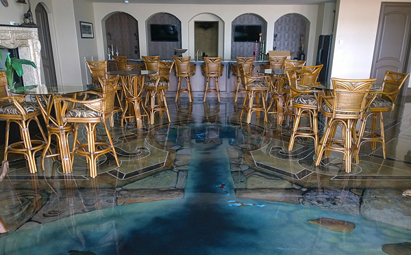
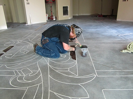
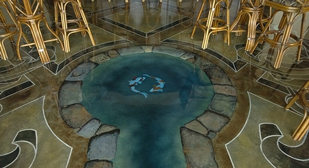
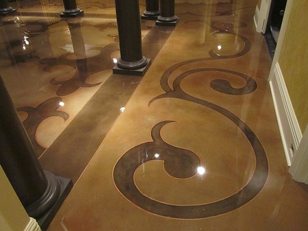
A 3-D pond in the billiards room
John Campbell of FLOORmap Stencil Designs helped me design this room. John studied illustration at the Savannah College of Art and Design, where he received his BFA. We have been close friends since we met in September 1996.
The homeowner wanted a water feature at the bottom of his stairway that he could look at from upstairs. I brought John in to design the pond while I designed everything around it. Deciding how to merge illustration into an engraved pattern floor was a challenge at first. Where do you stop engraving and start the illustration?
On every floor I engrave with a pattern, I want a border around the edge of the room. This creates a finish to the design, allows subtle interactions throughout the room and provides additional spaces for the eye to rest on as you walk through. It calms the design down a little visually and adds a contemporary touch to a more classical pattern. Since I hand-paint all my borders, I was able to create one that enclosed the space of the pond and gave John’s painting style a place to merge with mine.
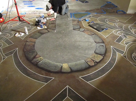
The precise placement of the wrought iron accents was crucial to the entire composition — too big and they overpower the room, too small and they look pointless.
Once I added the 3-D edge to the main pattern I had to plan how the wrought iron matched the 3-D point of view. Would it be at the same level of the main borders, or should it appear above everything slightly? We liked how it was slightly above the main borders, because it takes the viewer a second to notice it. Subtle design choices like this help sell the 3-D perspective from multiple points in the room.
We knew the general layout of furniture that Mark planned to place: a pool table, TV, and couch zone. The layout gave John and I a reason to pull the pond into the center area of the room. As with the wrought iron accents, we had to worry about the pond’s exact size and appearance.
I appreciate being able to draw design ideas for a project, just like I do when planning paintings. Most of the time, we can plan very precisely with drawings, and by mathematically hand-drawing on-site I can make changes when necessary. Using many drawings, we were able to plan these details very precisely. With a piece of soapstone, a tape measure, chalk line, straight edge and square I can come up with any shape and size quickly.
 |
 |
 |
 |
Once we understood our layout in relation to the stairwell, lighting and where the pond would protrude into the main area, we developed the placement of each detail. John and I sent revision after revision to each other until Mark approved.
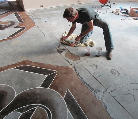
We acid-washed and scrubbed the floor. Then we laid out the entire design and engraved it into the floor. After that, John began sketching his pond on the floor. He hand-painted the stones while we hand-brushed the borders and accents.
Because of the amount of detail planned for this area, we chose to use a water-based stain. As John moved into the water features we helped paint more of the stones. It was a lot of fun planning each stone that traveled away from the stairs, which were intended to guide the viewer across the pond.
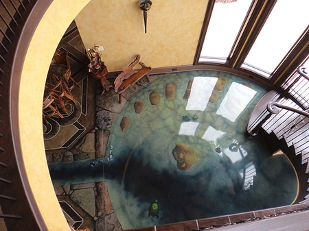
We left one stone out in the middle all alone. The viewer can decide to make that leap and jump to that lonely stone or admire the turtles that float between the areas. John painted turtles in full detail that appear to float partially above and below the water. Koi fish were painted in a perfect path to provide a Zen-like motion. Colors were layered through the water to create the appearance of stones that are submerged below the pond’s edges.
To help finish the 3-D look of the pond, John masked off all the stones to spray the water colors and the outside edges of each stone to create shadow. These painted-on details give an important realism to the rocks merging with the edge of the elaborate 3-D floor. Everyone that sees our photos questions us about how that pond could not be real. I just smile with pride every time, remembering the effort we put in.
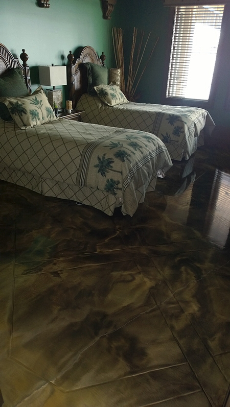
Unique patterns in each bedroom
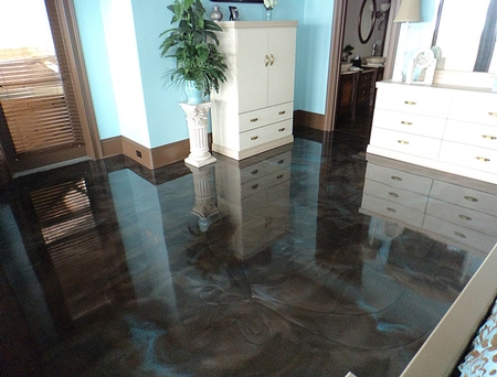
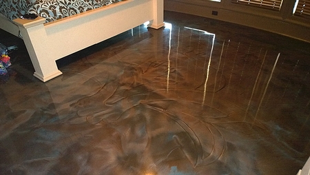
The second project in the home’s lower level required unique designs and combinations of metallic powders in three bedrooms. I brought in Ryan Samford, owner of EPO Floors, to advise on color choices and the application of each epoxy floor.
The mother’s suite has a contemporary design based on a small pillow that would be sitting in the room. To me, the design fits the style and feel that Mrs. Godsey wanted for the room. Then we poured brass, brown and red metallic epoxies onto the floor. As the epoxy leveled itself out we watched the design slowly reappear. Each engraved line fills with more metallic color and creates a ghost of the image. The floor levels almost perfectly smooth. This confuses the eye as to how you are seeing the image if you can’t feel it.
In the “Tiffany” room Mark wanted blue and silver with a hint of brown. After researching Tiffany-like designs, we came up with a contemporary floral image to engrave into the center of this bedroom. Then we added silver, sky blue and a hint of brown to the epoxy and poured them all over the floor.
As an artist who wants to be in complete control of every color, mark and line made, I think metallic epoxy is a crazy concept. The final look has this amazing liquid metal appearance, but instead of controlling every single brush stroke, we are at the mercy of the epoxy as it levels. It happens very quickly, and it is an awe-inspiring experience to watch how it will move through the room.
Instead of rolling back and forth like we commonly do when sealing a floor, we swirl an 18-inch roller in random directions. It is important to watch your edges when doing this, because if you don’t completely swirl the multiple colors you can sometimes see an edge that is only one color. I have seen other contractors trowel it down and add more controlled effects. We like the simplicity of the application and how unpredictable it can be, and we feel an 18-inch roller creates a great, easy look.
 |
 |
 |
The final bedroom is the “Tommy Bahama” room. Here I decided to do a large tile pattern with 6-inch borders that basket-weave through the room. It made me think of latticework I used to see when I lived in Savannah, Georgia, during grad school. This makes a really cool effect after you cover it with metallic epoxy. We chose to custom-make the bright tan color from a couple of different yellow and white powders, then added brown as a second color.
In all three rooms the colors were designed through the process of making multiple sample boards. With every sample we adjusted the amounts of each color and even how much secondary and tertiary colors to add. Every color scheme was approved by Mark after thorough discussions as to why we were choosing these color ranges and the design goals we were achieving with these choices.
Everything up to this point of the project took us about two and a half weeks. John’s pond was full of many details. Knowing that the pond was going to take the longest, we staged each other area to work around it. After the bedrooms and pond were done, we covered the rest of the lower level with a 10-20 mil clear coat of epoxy, then put a coat of polyaspartic over everything.
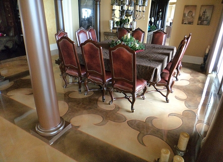
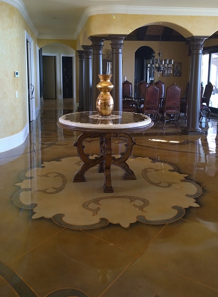
A medallion at the front door
Mark Godsey wanted to make a statement with his receiving area. When friends and relatives walk in, they are amazed by the stunning, simple and classy designs. He sent me a photo of the table that was going in the center of the foyer. I used elements of the design on the table as inspiration for the entire area.
By creating a medallion in the center of the entrance, I set the tone for the flow of the room and made a perfect place for the table to stand. I hand-drew 6-inch curving borders around the medallion, then mathematically laid out a tile pattern that would not travel outside these borders. I did four other curving borders that almost guide you through the rest of the space. Finally, I created an M.C. Escher-like pattern from elements of the medallion. I hand-stained it to have a checkerboard look to it, with a large border that follows the columns to separate the dining room from the rest of the design and still repeat elements from the rest of the room.
These columns were not yet built when I did all this work. They were framed into the ceiling design prior to me starting, but they were not yet installed. Ryan and I used a laser level and a chalk line to calculate the exact size of the border to match the columns. We all know that in this concrete world we get one shot at most of our processes. This is one of those, “measure 10 times, mark once, engrave” moments.
All of this is on top of a 1 1/4-inch thick subfloor, Lyons Manufacturing’s Superflow Crete. Ryan Samford and I took on this floor together. We glued and screwed down cement board going the opposite direction of the subfloor panels and filled all the joints. Then we primed the floor and applied self-leveling overlay at 3/8-inch thick. After we laid out and cut my design, we hand-stained all the borders, sprayed the main colors over the entire floor and filled all the engraved lines with brass epoxy. We finished the floor with a 10-20 mil coat of epoxy and a coat of polyaspartic. We added a very small amount of the brass powder to the epoxy clear coat. It was just enough to give it a little sparkle.
We did this floor in six very long days, about 140 man-hours. All of this work took hours of communication and planning between everyone. We didn’t just write up an estimate, show up the next day, and make it up as we went. Clients and projects like this take an amazing amount of time to plan. Once you agree on the layout and the colors, the install can go very quickly.
I often question if what I am doing with decorative concrete is art or just great design. I talk about it often with fellow artists and artisans. Even though this project may not be as imaginative as my paintings, it is still art to me. We created spaces that were one of a kind, that will never be duplicated.
Hopefully those floors last forever and many generations of Mark’s family get to enjoy them. And this series of artworks is not over yet. I still have the outdoor spaces to talk about and finish. I can’t wait to see how everything turns out.
Project at a Glance
Client: Mark Godsey, a homeowner in Chattanooga, Tennessee
Contractor: Concrete Mystique Engraving, Nashville | www.concretemystique.com
Artists: Rick Lobdell (Nashville), John Campbell (Fayetteville, Arkansas), Ryan Samford (Nashville)
Scope of project: Over a couple of months, we installed high-end decorative designs throughout the interior of a home. We did 4,500 square feet over three stages of work.
Products and tools used: Smith Paints water-based stains; SurfKoat’s Kolour Dyes, 1040 Water-based epoxy, 250 HP Cyclo 250 clear epoxy and PolyKoat GL 80 polyaspartic; Kingdom Products Imperial Epoxy 250 clear epoxy with Elite Crete’s Reflector Enhancer metallic powders added; Lyons Manufacturing’s Super Flowcrete, Engrave-A-Crete’s Cobra