For the first time in this series, I’m basing my article on a current job I just finished. In the last one, I introduced scrollwork as a design element. I was still focused on symmetry and using scrollwork as a larger medallion in a room.
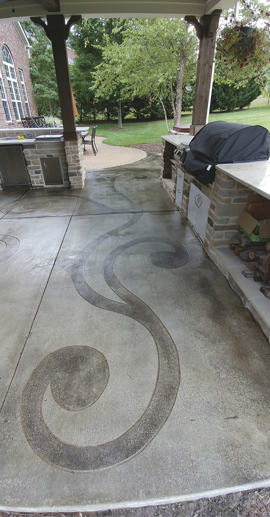
This time, the job involves an entire patio and all the obstacles involved. No tile going through it; just the pure layout of a space full of normal obstacles. On 600 square feet, there are stairs on one side, an island in the back, a fireplace in the front and furniture in between. The first thing I had to visualize was how to use the space with all these obstacles in my way. I noticed a clear path around the furniture between all the permanent structures.
After discussing options with my client, we came up with a design using the scrollwork through this pathway. Yes, some of it would travel under the edges of the furniture and the center medallion would be under parts of the coffee table. None of this bothered me because the shapes would be large enough to be seen while people traveled through the space. The coffee table is high enough to see under it.
Instead, I wanted to focus on how I could layout this design without making the space too busy or not busy enough. I focused on the spacing of the shapes so that the design had room to breathe. In pictures, my work always comes across as busy. I promise you it isn’t. My clients are always amazed by the simplicity of the design and love the flow of the space.
I still used the Cartesian coordinates on this floor albeit a little differently. Two quadrants match instead of all four. This job was more like creating a mirror image of the design than the symmetry I used in the last couple of articles. The bottom two quadrants match and the top two quadrants match each other. The coordinates theory still worked great for laying this out.
Central point
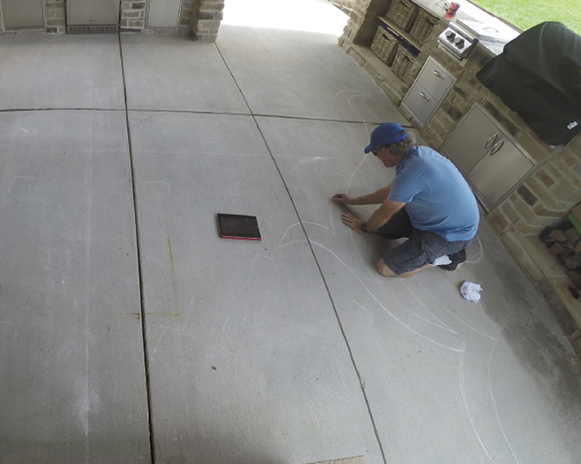
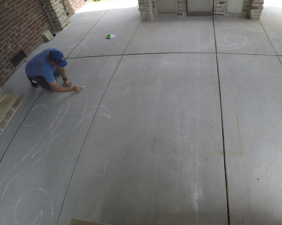
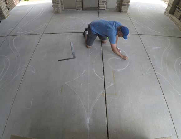
First, I had to find center and chalk a large “X” through the space. To find center I adjusted my layout to appear to flow between the center of the fireplace and the center of the island. Surprisingly they were off by less than 2 inches. I still had to use those two points for center and adjust everything accordingly. If I didn’t the design wouldn’t have looked centered even if it was. Even though there was extra space on one side due to the stairway I still felt the design would fit the space better keeping everything inside the rectangle made by the stairs, island and grill cabinets.
Next, I drew half of the design exactly the way I wanted it. I know this is the hardest part for most of you. You must take your time and focus on making the curves look clean. No straight lines should appear through a curve. Know where the furniture should go and be careful where you place your shapes.
I started near the fireplace and worked my way through the space. I also drew the shape in front of the island and then brought it back to the overall design instead of the opposite. I did this to help me with the curves I wanted and to stop any straight lines.
One down, one to go
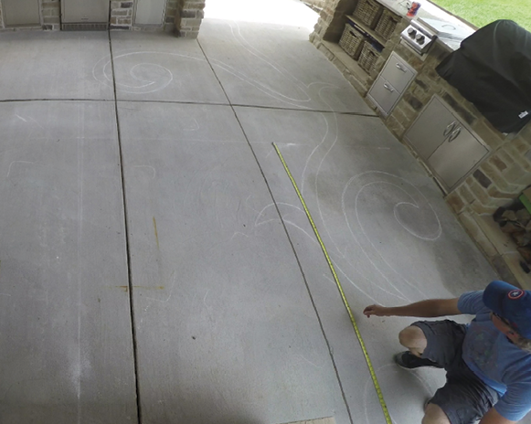
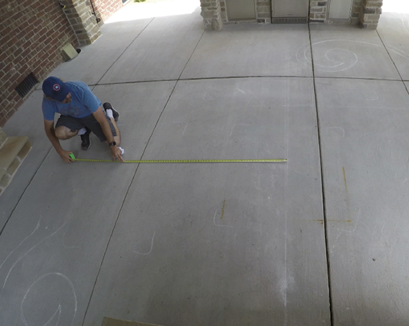
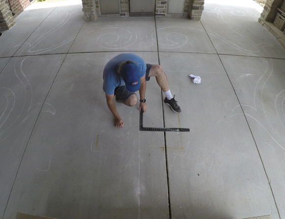
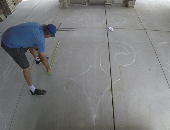
Once I was satisfied with the layout of the first half of the design, the second half was easy. The secret is plotting a lot of points so you can match every detail. The “X” in the center of the floor helped me measure and plot.
Since this was a mirror image instead of the same shape in all four quadrants, I sketched the lines as I went. In other words, I took this a couple of feet at a time, plotted the points in those couple of feet and then drew that part so I could see how it looked. Mapping out a design in a large space like this can get overwhelming if you aren’t careful.
When I got to the island, I couldn’t use the “X” as easily because the shapes were going around the island. At that point, I used the edges of the island and the “X” to confirm my measurements. After I was done with the entire layout, I stepped back and looked at both sides.
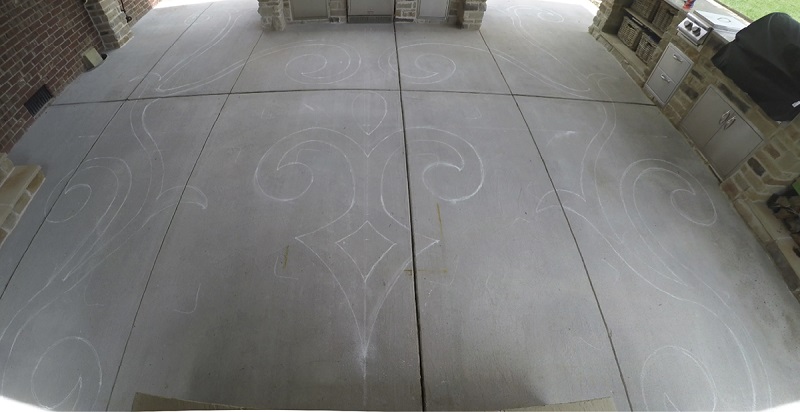
One thing I can tell you that happens almost every time is that the second half of my image looks better than the first. After analyzing each side, I tend to go back to the first half and adjust it to match the second. Usually this is because the curves I drew to match all the points look better. The first half is usually straight to the point so that I have my layout. After making all these adjustments both sides will match. Sometimes it helps to have your clients look at it and help you decide which details they like more. All of this is easy once you have completely laid out the design.

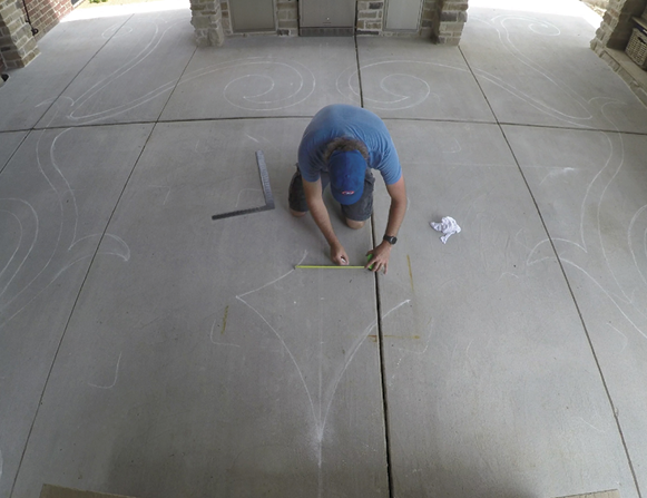
After I completed all the scrollwork, I added the medallion in the middle. Don’t draw the medallion first because you will have more trouble working around it instead of filling the space in with it.
Look at the spacing between the medallion and the scrollwork. It is extremely important to be aware of the spacing. This is the pinnacle moment where a design can appear too busy or too small. I can’t tell you exactly what spacing you should use as it’s different for each project.
Have fun with a project like this. I think they’re a lot of fun to lay out. I hope they are for you, too.
Video Tutorial