This represents the last column in my design-focused series, “The Elements of Style for Contractors.” Before I bid you all good-bye, I’ll summarize the main points. Concrete Decor posts complete archives of past issues, so you can check out the topics of the previous 10 articles.
Composition leads off
The series kicked off in January 2015 when I described the five composition ‘tools’ concrete artisans should have in their tool kits — Line, Shape, Value, Color and Texture. The first thing designers should consider is the shape of the given work space and how to divide the space to create a striking and balanced composition.
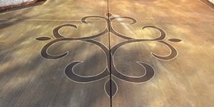
Quick thumbnail sketches often help you brainstorm ideas. A good composition will have an interesting division of space and a focal point which provides emphasis and detail. A logo or design plopped dead center in a floor is the most common but static design possible. By now you should be able to come up with better.
The most important quality of a design is unity or cohesion — the details should synchronize with each other so your creation looks and feels harmonious. This might be done by repeating a stamped texture which is finer in the border areas, or with a repetition of curved lines and shadows that set up a rhythm across the whole space.
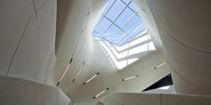
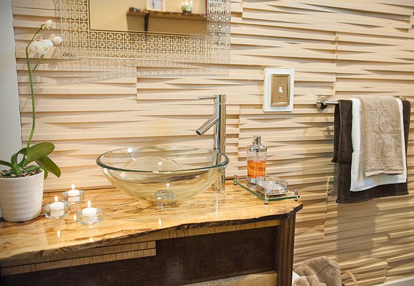
This is the office restroom designed by and for Bay Design in Waltham, Massachusetts. The original idea for the glass fiber reinforced concrete mold used was a pile of stacked boards seen from the side. The designer held to one simple integral color with no speckling or texture, which creates unity.
It becomes something more than an imitation, as changes in lighting create rhythm and movement from the shadows cast. It’s always a great idea to let the building medium do what it does best. GFRC can be molded so it casts shadows in bas-relief. It’s light and easy to combine in sections large enough so that the repeats are not obvious. A good design like this will often appear obvious and simple — once someone else has done it!
Lines and shapes
In subsequent articles I focused on each element in our tool kit. Young artists all learn to draw using line-making tools such as pencil or charcoal. They soon find that a few diagonal lines can express movement, when the lines are drawn with force and repetition. I used examples of drawings from art history. Since concrete is by nature three dimensional, it’s tricky to find examples of the use of line alone, but Brandon Gore’s famous “Erosion Sink” comes to mind.
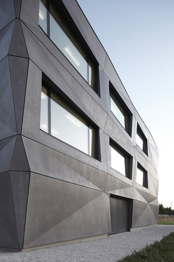
A few lines linked together create a shape. In good design, the form can express function, like this textile company’s building in Munich, Germany. The architect, Kurt Tillich, designed it to look like a folding cube of creased fabric. Depending on weather and time of day, the facade continuously changes in character.
Tillich kept color and texture to a bare minimum and varied just the thickness of the panels (unseen) and the width of the dark joints between them. This puts the emphasis on line and shape. By only using two elements out of five, the old saying “less is more” is proved true — artisans can make a stronger impact without using every element in their arsenal.
In the article “From Shape into Style,” I illustrated two kinds of shapes — geometric versus organic — and how their use in art morphed radically from the 18th century to the present. In July, we thought more about how to achieve visual balance in a composition, using black-and-white shaped mock-ups from Shirl Brainard’s useful book, “A Design Manual.”
Achieving balance
Formal bilateral symmetry is most common among concrete artisans, but I found a few good examples of asymmetrical design in concrete (most of which happened to be done by artists who turned to concrete later in their careers). I showed examples of approximate symmetry and how even random shapes can be placed to give a feeling of balanced weight.
The wall by Richard Winget of Authentic Environments in California shows an asymmetrical shape with a variety of line and movement that still appears harmonious.
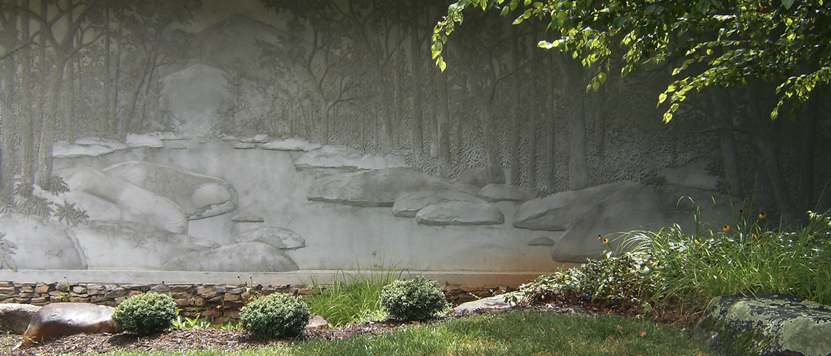
In September 2015, I introduced the range of white-to-black swatches that artists call the “value scale.” Another way to create unity in a design is to work within a close range of values, greatly varying shapes and lines to create emphasis. A fine example of this are David Seil’s relief murals, such as this one on the potter’s studio wall at Black Mountain Center for the Arts.
The depths of color
Next came two articles on my favorite topic — color. I even supplied full instructions on how to make a color wheel using acrylic art paints in three primary colors. This is an eye-opening exercise for anyone wondering how color mixing works with pigments.
In “Color is Amoral,” I stressed that a given color may look completely different (or almost invisible) depending on the surrounding color. Floor or countertop colors may even appear to be changed by lighting and wall colors which are only in your peripheral vision, so be careful! I related a few anecdotes on how areas of unstained gray concrete can appear as lavender or yellow once they’re surrounded by their complements. This is an illusion, but one you may have to cope with.
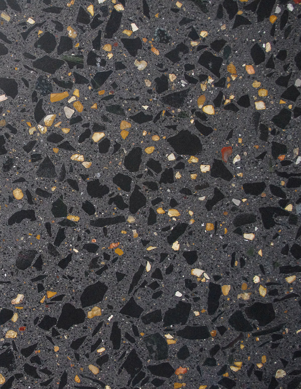
The easiest way to create harmony when a client forces you to use random colors you don’t want to combine is to surround them with charcoal gray or black, and choose one predominant color with the others as tiny accents. This polished wall panel with exposed aggregate done by Fenix Construction out of Missouri at the St. Louis Art Museum is a good example of this technique. There is so much charcoal and black in this wall that the surrounding matrix subsumes and enhances any random-colored pebble in the mix.
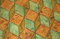
Texture and contrast
Texture is intrinsic to concrete and everyone placing it works daily with stamps, brooms or polishers. As a stainer, I’m more fascinated by the range of simulated textures you can achieve on a flat indoor slab using patterning materials scattered across a damp stain and removed during the cleaning phase.
Concrete polishers have also been discovering great effects using inlays and cross-sections of everything from gears and shells to bottles and cans. Perhaps this encapsulation of things recycled from the junkyard might even count as “green” points.
In “Dynamic Contrast,” I compared the color and texture scales we use to the dynamics of timbre and loudness in a musical composition. We experience music gradually across time, and we experience a large room in much the same way as we walk through it. We can orchestrate contrasts between rough and smooth, dark and light, curvaceous and boxy — if we learn to tune into them via conscious attention.
Every concrete artisan has had at least one revealing trial or mistake which may have resulted in a whole new artistic direction. Jazz musicians who squeak out the wrong note during improvisation simply repeat it several times in the next few measures to decorate the tune with it, which is why some claim “there are no mistakes in music.”
Dream on
In closing, I hope my Elements of Style series has been the catalyst for a few more of your conscious experiments and insights. My dream is to make a documentary video along these lines, but that’s still on the drawing board. Thanks for your interest and comments.