In several past issues I have argued that “less is more” and that you should harmonize colors and limit the range of effects you use on any one job to create artistic unity. This is something I firmly believe in. Beginning painters get so excited by the smorgasbord of shapes, colors and textures they have been learning that they often try to put every trick they know into each of their paintings. This leads to a hodge-podge with no focus. One of my teachers used to constantly remind us that, “A painting is not a paragraph — it is just a sentence.”
The other side of the coin is that a work of art needs vital contrast. Musicians know this very well, since they work across time. They usually begin a piece quietly and slowly and build up to a central exciting crescendo, then finish off with a diminuendo (or a big bang) at the end. In music this is referred to as “dynamics.” In visual art, it’s “contrast.”
When we are working on a large project we are also working across time — the time it takes someone to enter the decorative concrete area and pass through it into smaller spaces where they will walk more slowly and study the details of what you have done. It might help to conceive a large project as an orchestrated experience in which you are in charge of the dynamics.
It’s elementary
In the 1980s in Houston, Texas, I had the best job possible for an artist. I was a visiting artist with a special program which sent artists, dancers and musicians into elementary schools to devise lesson plans with teachers which would cover the basics of our art form. We each brought supplies to the classroom for a series of 45-minute lessons.
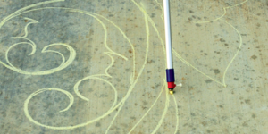
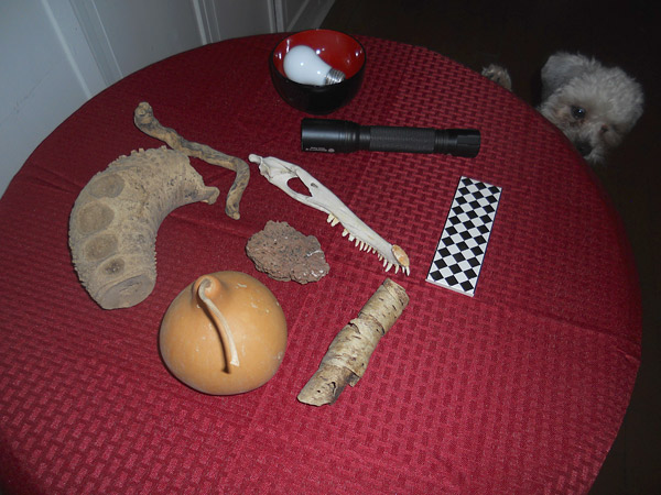
I wanted the kids to think about the random, organic shapes in nature and not just the squares, circles and stars they are so often taught to draw. I passed around driftwood, gourds and bones I had brought in a basket and let them feel the organic shapes with their eyes shut. Then we all pointed out the more geometric, manmade shapes in the room such as windows, doors, balls and books.
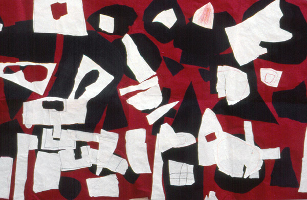
The children got a piece of black construction paper with instructions to tear by hand an organic-looking shape which appealed to them. I spread a long piece of red paper on the floor and had them glue their shapes wherever they wanted. Then I gave them a piece of white paper and scissors to cut out geometric shapes. It often happened that one child would get the idea of tearing an organic hole into the center of his geometric shape or overlapping two of them to make a vehicle or animal shape. By working on the floor the kids were freed up from their desks and we ended up with a surprisingly abstract mural which the teacher could hang in the hallway.
Geometric yet flowing
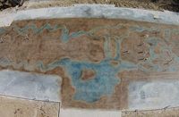
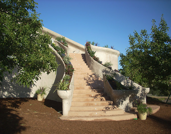
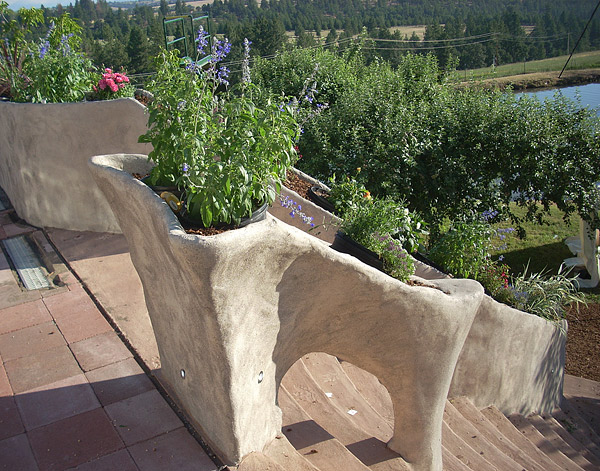
In the April 2013 issue of Concrete Decor I found a perfect example of this exercise embodied in concrete. Azure Standard, a natural foods grower in Dufur, Oregon, had an abandoned two-story warehouse and deck which they wanted to turn into an enhanced special events venue for a family wedding.
They hired Robert Merrill of Northport, Washington, who used local materials to devise a design featuring a geometric staircase with a contrasting planter turned into a bannister which was as organic and flowing as could be. He even split the staircase into two sections so it could flow around a small tree which was already growing at the base of the staircase. Merrill used local earth and sand to color the staircase, which subtly contrasted with the white of the planter-railings. The textures of the two parts also contrasted, as they were made using very different techniques.
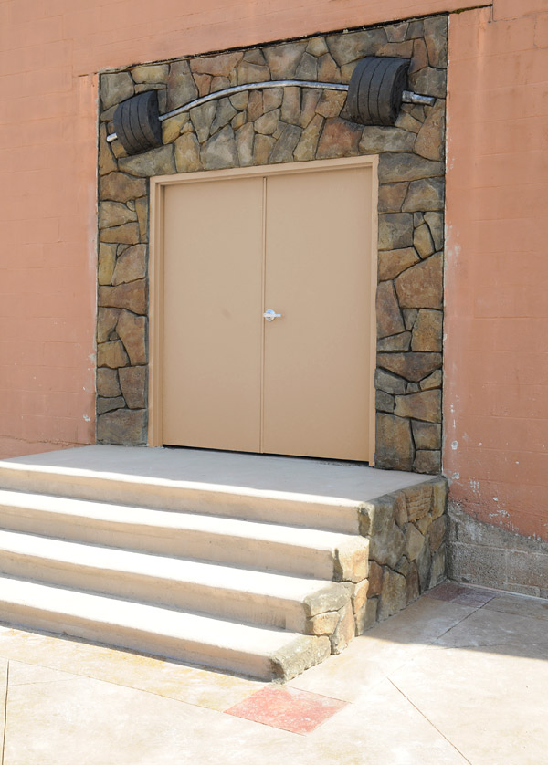
Another striking contrast can be found in the makeover done at the Charlotte Rescue Mission as part of the 2013 Concrete Decor Show’s workshop there. Nathan Giffin and his students wanted to highlight the facility’s very industrial-looking entry to a new gym. They surrounded the doors with some natural-looking faux stone in the strongest possible contrast to the metal doors. Then, as a contrast-within-a-contrast, they included a heavy bending barbell as an archway above. This is a brilliant effect which also seems to defy gravity.
Any strong contrast — whether texture, shape or color — can become a real eye-catcher. Just don’t use all three at once. I like the fact that the barbell picks up the pale gray color of the bland doors. That was a nice, understated choice.
Contrasting yet complementary
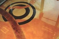
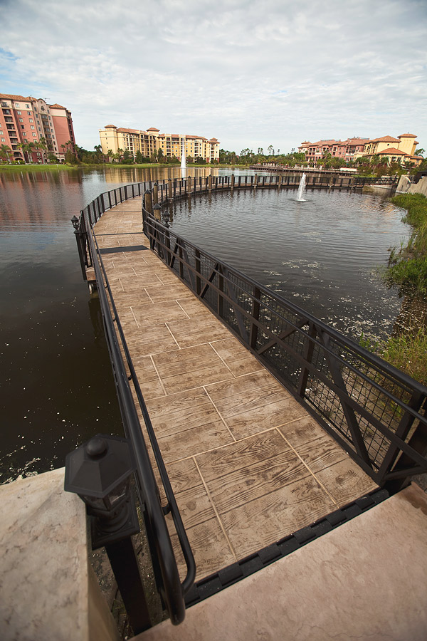
In the same issue, we see David Edwards, of Edwards Concrete in Winter Garden, Florida, who was given a long curving bridge to pave in a bucolic lakeside setting. His “pavement” of faux wood boards hearkens back to the worn wooden docks we always see in beach resorts. But by printing the boards in offset blocks with grout between them, he is saying, “These may look like worn wood, but they are really nonskid concrete paving stones.”
By having the boards run in short, horizontal units, he mimics the pattern of wavelets in the water under the bridge, while the squares containing them echo the square metal pattern in the railings. Here we have a series of contrasts of materials and color which work together to be aesthetic and practical at the same time.
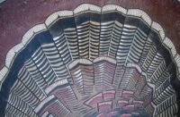
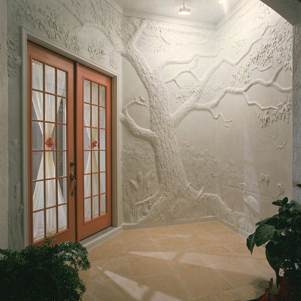
What a relief
As a final example I will show you something which at first seems to be very low in contrast: an entry wall by David Seils that was featured in Concrete Decor February/March 2013. This sculptor from North Carolina imitates classical Greco-Roman walls which portrayed figures and events in low-relief carved marble. He starts flat and builds up his relief, using Sakrete’s High-Strength Mortar/Stucco Mix. He adds layer upon layer without it cracking.
He did his first mural in the late ’80s and has been going strong with great commissions ever since. Seils began training as an artist in the third grade and was once a freelance architectural renderer. The contrasts he creates are all contained in shadow-casting textures which seem to alter the shade of gray or white he is working with.
His walls are so perfect that I cannot imagine adding color, glass shards or pebbles to any of them! This is truly a vital contrast using the economy of means which artists work a lifetime to achieve.