So far, I’ve written a lot about math and my love for it as it is truly my favorite part of my decorative concrete work process. Recently, however, I’ve been getting requests to turn my attention to color, which I think would be a nice change of pace. Let me warn you in advance: If you thought talking math with me was complex, wait until you hear my take on color theory. I can go on for days.
When I researched how to explain the values of color, I had a lot of trouble finding definitions that most people would be interested in. This article is not about explaining how light travels through the universe and because of it we see an array of fruit flavors. The key point I want to make is that people need to visualize that all color has a value. This is not just understanding black, white and gray but to also understand that all color ranges we use have value ranges within them.
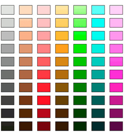
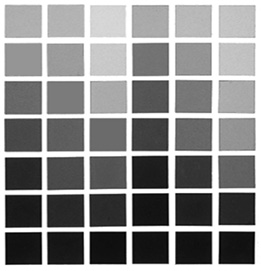
When you look at figures 1 and 2, you can see a range of values for each primary color and a gray scale. From my perspective, pink is a light red, tan is a light brown, cream is a light yellow and so on. Compare those individual color ranges to the gray scale. You can see all the different ranges of color that can be achieved just from understanding the value you want to create.
Manipulating stains
For the most part, the decorative concrete industry is very limited on color. Most companies only sell one color of blue, green, yellow and so on. Most of them have an earth-tone component.
With acid stains, for example, you have to work with a basic color chart. Most color charts show you what the color will look like if you don’t dilute it with water or if you seal it with a specific sealer. What they don’t show you is the color range you can achieve by adding more or less water to the stain.
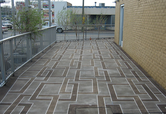
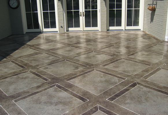
I rarely use any stain at “full strength” as this allows for huge value changes within just one color of any type of stain. For example, in figure 3 you can see four different values of a grayish brown and black. All these colors are obtained from the same black acid stain I use religiously. Figure 4 has three different variations of the same black acid stain. To recap, there are four different values in figure 3 and three different values in figure 4.
An inside job
Aside from overall color choice, when we’re working on an interior project, the first question I ask clients is if they want the room to feel larger or smaller. The rule of thumb is lighter colors will make a room appear larger and darker colors make it seem smaller. Another side point to this same theory is that light colors show less scuffs, scratches and dirt whereas dark colors show everything. Often this is because light — natural or controlled — reflects off everything. Darker colors absorb more light. Lighter colors tend to reflect the light. A darker color shows all the scratches and imperfections because it’s holding in the light. The light colors reflect the light and help make the room feel brighter.
When clients say they want a brown floor, they need to specify a light or a dark brown. When they want a border to be darker, do they mean in relation to the walls or the floor?
If you put a dark border next to a very light baseboard around the perimeter of a room, the value of the baseboard makes the border appear even darker. Every color used has a value to it. I’m not referring to a numerical value, but a black and white value. This is important when you are deciding the perfect color scheme for each of your clients. You want to visualize the result of your color choices and be aware of how each color choice affects everything around the space.
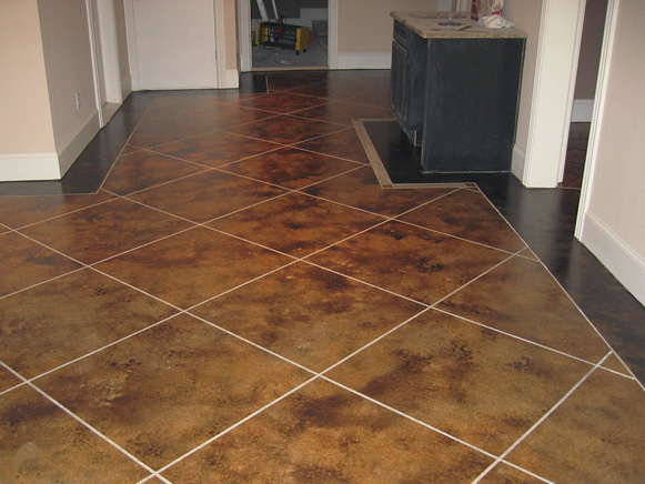
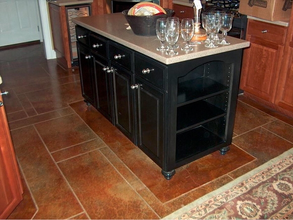
Look at figures 5 and 6. Figure 5 has a dark border next to a white baseboard. Figure 6 has a deep reddish brown next to a dark island cabinet. The darker border in figure 5 frames the room with a sharp edge around it. The borders in figure 6 complement the main color and keep the room looking larger or more open. Both look great.
I never decide which is better for a client. I show them options and work with them through these choices. I always tell my clients two things. First, every choice I show you will look great. Second, this isn’t my house and you need to help me determine which colors and values to use because you live here not me.
Color relations
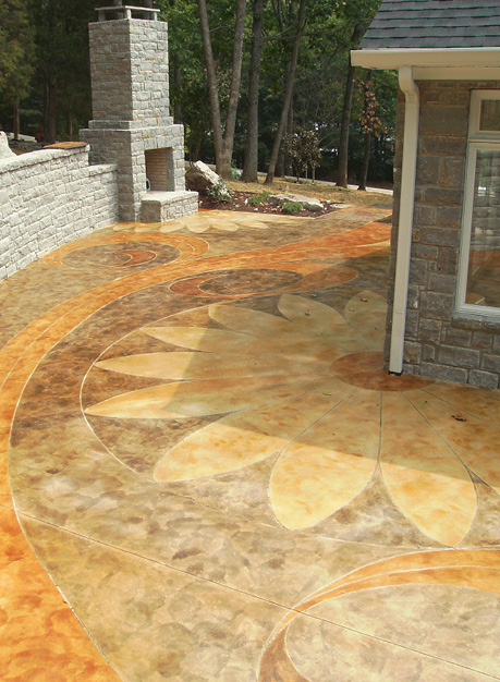
Check out figure 7 where you’ll see orange, gold, red and brown. The gold is the lightest value. The orange is the next lightest. The red and brown are similar in value, but the colors are completely different. Even though orange is the next lightest color, it’s not that light compared to the red and brown. Personally, I like to have more contrast within my color choices, but this project worked great with all the colors having a similar range in value. I can’t say that will work every time but it did in this case.
The hardest thing to understand when talking about color value is that it always must be in relation to another color. Without the other colors, value only matters when talking about how it makes a room darker or lighter or how hot your feet get when walking on a pool deck.
When you’re selling a pool deck, clients don’t care about color value. Most only care to know the color isn’t going to be too hot when they walk barefoot on the deck in the middle of the summer. During the sales call you, as the expert, must be aware of clients’ expectations before they are. Understanding the value ranges of each color choice will help you have that advantage.
Art professor Steven Ochs of Southern Arkansas University says an easy way to check value is to make a black and white copy of the design. If it looks drab gray, you’re lacking the contrasts between dark and light tones to help create separation between colors.
Beyond color choices
As you sell and create your next project, don’t just pay attention to color choices. Be mindful of each color’s value in relation to the others used and to the space around them. You always want the floor to be a different value than the walls. Most people choose darker values, but some opt for lighter. There is no steadfast rule as to what looks better. It is always in the eye of the beholder, which is your client — not you.
However, pool decks are good examples where the overall surface should always be lighter. On inside projects, evaluate your color’s value in comparison to the cabinets or wall paint. It will change your perspective of the value color has in the world around us.
