
When Concrete Decor magazine suggested “maintenance” as a subject, I jumped at it! After all, this is something that torments most decorative concrete contractors, unless, that is, there is a significant maintenance profit center to their business. In the case of The Concretist, there is not. We have always been more focused on creating than maintaining, although we certainly have an interest in our projects looking as spiffy as possible.
Most of our work has involved interiors, so we’ve tried to maintain relationships with skilled janitorial firms along the way. A skilled janitor is like a skilled auto mechanic: worth his weight in gold (even though, lucky for us, most don’t realize it themselves and don’t charge that way). The maintenance of our exteriors has been directed to other concrete contractors with a dedicated maintenance component to their business. These guys seem to be more aware of their worth, and so you pay for it… That’s OK, it’s money well spent.
It also behooves us to completely disclose the pluses and minuses of all aspects of maintenance to our clients, although I’m not sure, even after serious attention, that many have really gotten it. Whether commercial or residential clients, most claim to have an interest in maintenance and to be committed to at least some level of effort or allocated budget. However, I have yet to see a consistent level of follow-through. This being the case, what are the things that we can design in that allow for the best-looking product all along the way, whether it’s well-maintained or not?
Take the middle road
We’ve found that, almost always, the middle road is best – concrete not too dark but not too light. Concrete less homogenous, with some variegation of color. Concrete not too smooth, with some texture, but not too much, sealed enough to protect and look “finished,” but not too glossy.
Dark colors don’t show stains and scuff marks like light colors, while lights don’t show dust and scratches like darks. In general, medium-saturation colors wear best. It’s also best to not apply especially dark or saturated colors (stains, dyes, tints) over a really light substrate (such as a white cement-based concrete or overlay). The same goes for really light titanium white or yellow oxide tints over a darker substrate.
We prefer paving with some level of visual movement in both color and texture. Seamless texture mats over complimentary colors of release agent over hardener work well, as do layers of complimentary tint and dye washes and stains over a chattered, sweated natural gray base.
It also helps to prewear the concrete, removing any weak cement paste that was likely to wear off quickly anyway. Of course, a ground surface with all of its paste removed and the subtle drifts of its fines and coarses exposed is the ultimate expression of this. Whatever wear can be borne by the harder sand or aggregates, rather than cement, is best. With nonground surfaces, we achieve this by sanding with a floor machine. If there are any highs and lows to the concrete, this process finds and defines them, removing vulnerable high spots while leaving protected lower areas untouched. On a micro level, sand is exposed in cross-section at the highs, contrasting with a denser cement paste left at the lows. This is better on lightly textured stamped concrete or concrete with chattered or sweated finishes, but it works on smooth troweled surfaces too. Not only does it prewear, it adds an element of subtle serendipity, turning simply troweled natural gray concrete into something akin to stylized honed limestone.
Speaking of honing, in general, a honed look is preferable to a polished look. Concrete that is glossy needs to be maintained to remain glossy. And the glossier it is, the sooner that scratches and wear patterns will show. We prefer to apply the minimum level of sealer needed to protect. We also try to allow that sealer to penetrate as deeply as possible, or to at least provide as many protected low areas on a micro level as possible. Better that the sealer is in, rather than on, the concrete.
We prefer thinned solvent-based, VOC-exempt acrylic sealers. These penetrate deeply, don’t build up excessively and appear natural. They’re also inexpensive and easy to fix if something goes awry. You can also buy the sealer with, or add, a dulling agent – a super-fine sand that doesn’t change the texture, but refracts, rather than reflects, light. The protected low areas are produced through a more textured finish (stamped, chattered, sweated, sanded and, sometimes, acid-etched or blasted). If something requires a higher buildup of sealer (for protection), you may want to consider dulling it with an abrasive scuff pad on a floor machine. This produces millions of microscratches that, again, refract rather than reflect light. Sometimes a true penetrating sealer or impregnator is just the ticket! Or, a penetrating sealer/impregnator followed by wax, driven into the pores with a good buffing by a floor machine. Ooo! A good buffing with a floor machine … Sounds exciting! Perhaps I should rethink whether The Concretist pursues a significant maintenance profit center or not?
Case study: Katherine Delmar Burke School, San Francisco, Calif.
In 1996, my art director, Karen Tierney, and I were engaged to produce a series of world maps for a prestigious San Francisco girls’ school. The venue was three 600-square-foot outdoor courtyards. This was new, from-the-ground-up concrete, to be illustrated in a style that was nearly photorealistic. The concrete was placed and colored with an off-white hardener by Bay Area Concretes Inc. It was finished in a swarthy, leathery fashion (great for reproducing both oceans and landmasses). The Concretist then laid out and diamond-cut the map grids as contraction joints.
According to this writer, the finish was great! We subsequently sanded the slabs with an 80-grit screen, wore off any weak cement paste, visually accented highs and lows, encouraged deep penetration of the copper and iron-based acid stains (with boosted acid content to further augment texture) and dyes, and created protected low areas for deposition of tints. I was young, bright, impetuous … I was fantastic!
What could go wrong?
The job was near the ocean, about as far west as one could go before wetting your feet in the Pacific. We were placing concrete during the summer break. The project had to be completed before kids returned for school. I had allowed for a little more than 30 days for the concrete to cure/dehydrate before beginning staining. During the summer in San Francisco’s East Bay, where I live, this would have been absolutely appropriate. However, in The Avenues, it was foggy, producing surface water every morning. That’s every morning until just before noon!
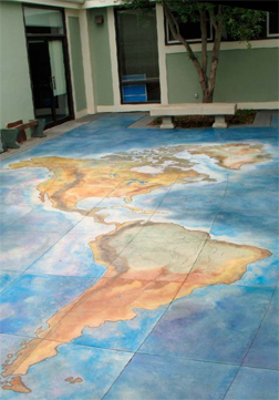 As art directors, we had specified an off-white color hardener as a canvas to start from. We needed to produce bright ocean blue-greens, earthy tans and dirtier greens for continents, and even white snowy ice for Greenland, Northern Europe, etc. These were to be done in a representative style, like watercolor, with soft or liquid color transitions and no distinct separations.
According to “Miller’s Rules” (which hadn’t been entirely compiled back then), it’s not a good idea to apply darker colors over a lighter base, but I don’t know that we had a choice. And we were intending to go no darker than was necessary.
We sallied forth and, primarily thanks to Karen, produced one incredible piece of concrete. Yes, we were fantastic! That is, until we sealed with a dull-rubbed, thinned-down, solvent-based acrylic lacquer, which we further dulled by scrubbing with a scuff pad. Well, even then we were fantastic – until the next morning, when the copper-based stains, upon going anaerobic in a still slightly moist environment, began to turn somewhat black. Ughhh! We chocked it up to artistic license, were able to explain that this was all part of the plan, noting that those dark areas were the deeper parts of the oceans, and collected our check.
It still looked great, but, not surprisingly, didn’t wear particularly well. While the applied colors remained, scratches posed a constant problem.
Second chance
Fast-forward to 12 years later. We were again retained, this time to spruce up the maps, which had become a perennial hit with the students, parents and staff of the school. Refurbishment was under the direction of my partner, Kelley Burnham, and our current art director, Martin Webb. Kelley and Martin were determined to not make the mistakes that the hotshot Mike Miller had made.
A methodology was developed and proven out through site mock-ups. The slabs were lightly sandblasted to remove the original scratched acrylic and to further increase penetration and develop protected low areas. Amazingly, even after sandblasting, the graphics from the original stains, dyes and tints were still visible. This is an applied color system where the materials had hung in there outside, under heavy use and with no maintenance, for some 12 years.
There was no sign of a current moisture problem, but Kelley and Martin discarded any patina stains as an option, developing the system around Colormaker Floors’ Aquacolors (super-finely ground pigments in a water or water/acetone or alcohol base). These could be used to produce a mid-range (remember the “middle of the road rule”) level of coloration in a realistic watercolor style. The maps were again sealed with a dull-rubbed effect using thinned-down, solvent-based acrylic lacquer, which we again further dulled by scrubbing with a scuff pad. And, again, we collected our check.
www.theconcretist.com
www.thevisualconcretegroup.com