There is a famous paperback called “The Elements of Style” by Strunk and White. Many writers treasure it as a guide to writing clearly and succinctly while avoiding common grammatical errors. The handbook itself is a model of clarity.
I had 26 years of studio work and art classes behind me as a fine arts painter when I gave up in disgust at the ploys involved in marketing art. In comparison with the world of galleries and critics, what contractors asked me to produce on floors came as a refreshing whiff of common sense.
Fifteen years later, I decided to teach some principles of design and composition to my contractor-students. Having some knowledge of the way artists think about filling space truly helps in choosing materials and structure. Therefore, I undertake this series of articles to present The Elements of Style for Contractors.
Some of my previous articles have redefined a commonly used word such as “line” or “composition” in artistic terms. For this article, I’ll do the same. When artists speak of “value” they are not talking about the pittance they got from the insurance company when their latest masterpiece was stolen from an exhibit. (According to my insurance company, until a work of art has been sold once, it has no value beyond the cost of the materials used in its construction.)
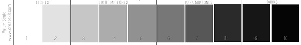
It’s a good thing most artists don’t create art for the money. When we talk about “value” we are usually referring to the 10-step value scale from white to black. This is a quasi-scientific rendering of 10 shades which the average person would discern as progressing in equal increments. You can download and print out your own value scale from several websites, such as www.create38.com.
If printed on heavy paper, you can trim the value scale down to a handy strip and, using a hole-punch, put a small hole in each rectangle. By holding the strip next to any color on your stained or painted surface, you can judge fairly well the value of the color in that area. Every color has a value range from light pastel (the “high key” colors) down through the darkest shade in which the color (or hue) is still perceptible.
Three aspects of color
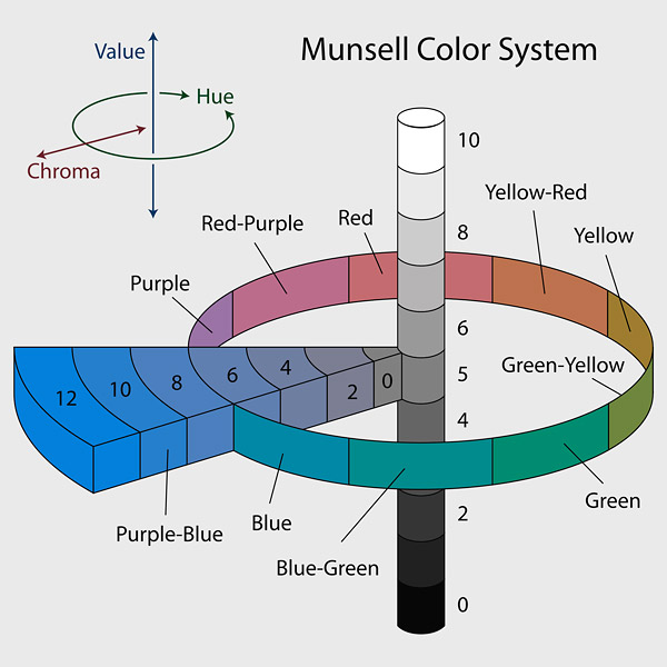
Color is complicated because it has three measurable aspects built into it: hue, value and degree of saturation (or purity). In the early 20th century an art professor named Albert Munsell devised a way to portray the location of each color in three dimensions, which came to be called the Munsell Color System. Wikipedia has a good description of his methods. We will discuss color attributes later in this series. Today I want to consider the grays in concrete itself and how advantageous it can be to restrict your palette.
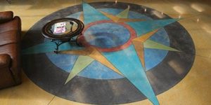
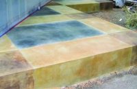
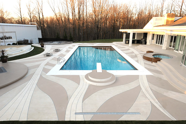
Look at the three close values of tan used in this patio designed by Gregory Mata of Cutting Edge Decorative Concrete for a home in Chesterland, Ohio. The reason he can use such dramatic intersecting curves and maintain unity across the composition is because his palette is limited.
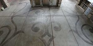
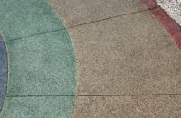
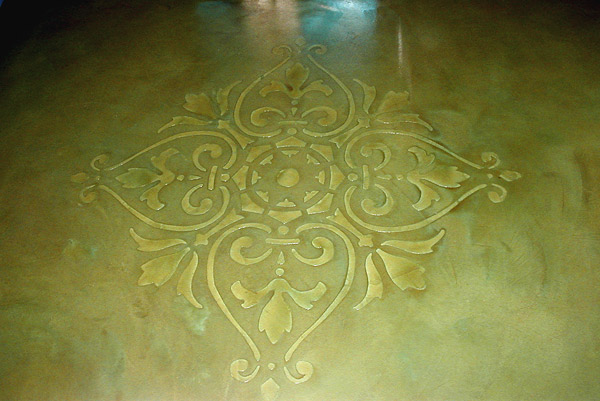
Here is an example of an intricate design done on an acid-stained floor by Todd Seaboch of Concrete Craftsmen in Santee, California. Instead of looking fussy, it exudes refinement and taste due to the subtle value changes in the chosen green stains. When putting that much effort into a design on the floor, I would have been tempted to place it within an oval frame and use a strong value contrast to “make it pop,” but looking at this image I see that Seaboch’s choices were much better.
Wabi-sabi
The modernist German-American architect Ludwig Mies van der Rohe (1886-1969) is famous for stating that “less is more.” To most contemporary artists this means that great beauty and power are to be found in using an economy of means. In Japan this is part of an aesthetic called wabi-sabi that dates back to the 14th century. It is why the design of Japanese homes and tools has such a timeless, spare look about them. In Western Europe simplicity came as a much later discovery, following the heavy, excessive decoration used in the Victorian era.
In “Wabi-Sabi: For Artists, Designers, Poets & Philosophers,” author Leonard Koren writes “Wabi-sabi is the quintessential Japanese aesthetic. It is a beauty of things imperfect, impermanent and incomplete . . . modest and humble . . . things unconventional . . .
It is also two separate words, with related but different meanings. ‘Wabi’ is the kind of perfect beauty that is seemingly paradoxically caused by just the right kind of imperfection, such as an asymmetry in a ceramic bowl which reflects the handmade craftsmanship, as opposed to another bowl which is perfect, but soul-less and machine-made. ‘Sabi’ is the kind of beauty that can come only with age, such as the patina on a very old bronze statue.”
The Wikipedia listing about wabi-sabi included a phrase that really resonated with me, stating that it could involve accidental imperfections which occur during the construction process. To me, nothing is more accidental than floor staining. Every two or three jobs we do, we see some odd anomaly we have never seen before, so there is always a new puzzle to solve. I like taking a creative attitude toward that. If you try to get too controlling with these floors you can give yourself ulcers.
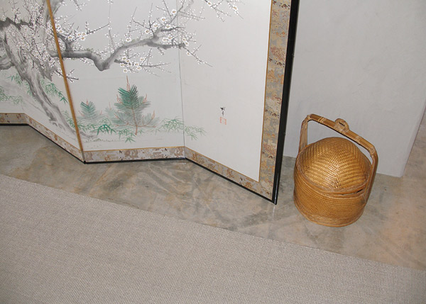
In 2009 I had a felicitous experience with wabi-sabi. My scientist-client had married a woman of Japanese descent. For their retirement home in Sandia Park, New Mexico, they designed the smallest and simplest residence permitted by their community. They wanted an uncluttered Japanese-style adobe home in the high desert. The owner joked that, being Southwestern on the exterior, it would be more like “wabi-sabi meets kemosabe.” The design featured pale mud plaster walls and custom Japanese sliding doors of wood and paper. I had to agree not to use a drop of stain, but simply to clean and seal the original concrete foundation.
By the time Faux Real got to the floors there were abrasions and bucket rings from trades working before us, so making the gray concrete look “natural” took some doing. When it came time to conceal blemishes between coats of sealer, I mixed about 10 shades of gray.
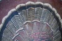
As it happened, the slab had been poured in the winter and covered with “blankets” to slow down the curing process. This left wonderful streaks of darker gray wherever the rumpled plastic rested on the slab. There must have been some iron oxides from sand in the folds, since some rooms had delicate tints of gold overlaying the grays. As the detail photo shows (to the left), this was the most beautiful floor we ever didn’t stain!