


I am a fan of the old spaghetti Westerns starring Clint Eastwood. At first glance he looks like a scruffy slob with a three-day beard who smokes too much and shoots anyone who looks at him sideways. However, when you meet the other guys in the movie, he becomes a well-attired paragon of virtue! In a nutshell, that is what I want to say about color.
Standing alone, a color is amoral — entirely relative to what surrounds it. This extends not only to the colored border around your design, but also to the walls and ceilings in your peripheral vision when you glance at the floor. One of the first questions I ask new clients is, “What color are the walls going to be?” If they reply, “but I want you to do the floors,” I launch into my spiel on color relativity.
It’s all relative
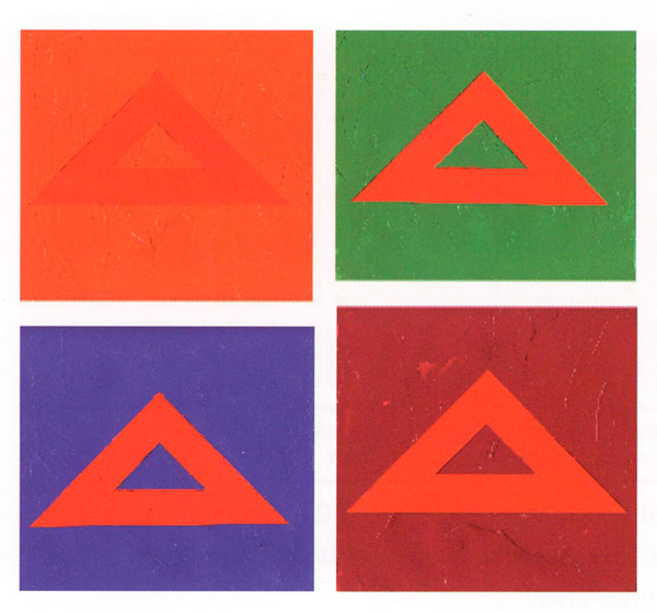
Look at the red triangles below. They were all cut from the same piece of paper and glued to background sheets of another hue. As you learned in the column about the color wheel, red will positively vibrate against its complement, a green of similar value, and will almost disappear when placed against red-orange. This is a lesson in direct contrast.
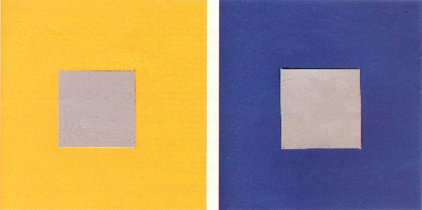
 A more surprising thing happens when you take a neutral gray square and surround it with two different hues. A gray patch will always be pushed toward the complement of the color that surrounds it. Put yellow around it and it becomes lavender (violet is directly across from yellow on the color wheel).
Surround the very same gray with blue and it will take on an orange cast. This is called simultaneous contrast. Impressionist painters used this trick to heighten the impact of color in their paintings. If they wanted a group of yellow flowers to look more yellow, they painted the shadows and leaves around them in greens which were adjusted to be almost violet.
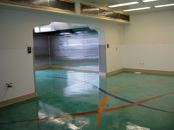
 Early in my staining career we had a floor that had been splattered with liquid curing compound during placement. We didn’t yet know that scrubbing with a strong degreasing agent can remove curing compound so we scrubbed twice with trisodium phosphate and water. However, after staining the floor with aqua blue, scattered spots of the original gray concrete remained. Except now they were a pale shade of lavender! The client said, “I didn’t think you had that color on the stain chart, but I like it.” This was not a fleeting illusion. Everyone who saw that floor said it was turquoise and lavender. (This led me to formulate my first stainer’s axiom: It is better to be lucky than smart.)
Live and learn
A frequent problem we have all encountered is this: Your client gives you three or four color swatches and tells you they are the company (or school’s) colors and they must be used in your design. You think they look awful together and that the selection must be a case of “Art by Committee,” a mash-up of compromise. How can you create unity and harmony with these colors? In flipping through my back issues of Concrete Decor, I discovered some clever techniques used by others.
Surround the colors with black or dark gray — In the February 2010 issue of Concrete Decor, Jeffco Concrete used the popular compass rose design in this lobby (reproduced on facing page). What makes it unusual is that Jeffco used every tertiary color on the wheel from yellow-green through red-orange, except violet. In theory, they should not all harmonize, but here they do. I think this is in large part due to the wide band of charcoal gray which surrounds the logo. It also helps that the dye colors have a similar value and transparency which link them.
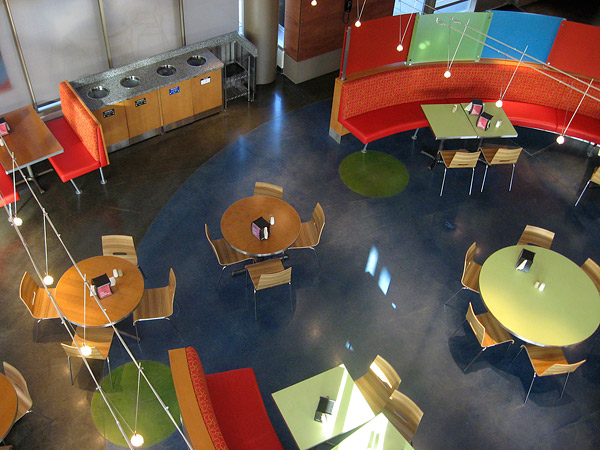
Another example from the February 2010 issue is the Microsoft commons floor. It looks as though the architect specified the high-key complements of yellow-green and red-orange to enliven the tables and chairs in the seating area. The choice of an almost-black floor, with just a few inset circles of green to mimic the round tabletops, was a sound one. For some reason, any group of vivid colors looks fine when surrounded by black. Black both harmonizes and intensifies saturated colors.
Use the colors in widely differing amounts — Another way to unify disparate colors is to choose the one you like best and stain most of the floor that color, with the others used as small accents. I call this “the throw pillow” approach, often used by interior decorators. This floor featured in the November/December 2010 issue is stained entirely in blue-green with just a few long spears of the three primaries, and it is effective.
Many designers use a three-color plan, but they are rarely used in equal amounts. When you look at the intricately patterned faux-carpet designs in some of Modello’s ads, you’ll see the most striking ones allow a single color to predominate, with two accent colors used in relatively small amounts.
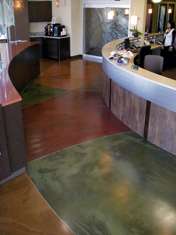
Alter each color with shades or tints — If the client agrees to it, most colors will appear to harmonize if they are all tinted with white to the same shade of pale. This produces a look that Westerners consider overtly feminine, so be careful. You would be safer to darken each color with gray, or to stain over a dark gray slab, which is what Kevin Ross did at a surgery center in California that was featured in Concrete Decor’s November/December 2010 issue. I can think of no other way to make equally sized segments of red, green and yellow appear to go together.
Use the ‘mother color’ trick — One of my painting instructors taught me this. Suppose you have six varied hues you want to include in a painting. Choose one color (for example light green) and add a tiny amount of it to every color you use in the painting. Voila! Your entire canvas will be unified. The amount of mother color mixed into the others can be very small, but it will magically crosslink all the hues.
This works just as well on the macro-level for house painters. If you want the red front door of your brown-shingled house to somehow ‘speak to’ the dark blue of the shutters, just pour a generous cup of the red paint into the gallon of blue and stir well. The blue color will be shifted by an imperceptible amount, but the effect seen from the street will be much more harmonious than it was when the shutters were painted straight from the can.
Tone it down! — This may be your most vital rule of thumb. Any color looks twice as brilliant, or obnoxious, spread over a large surface as it does on a small paint swatch or floor sample. As a teenager I adored a sort of gray-pink color. I gleefully found it on a swatch at the paint store and painted two walls of my room. Yuck — I was drowning in a bottle of Pepto-Bismol! I freely brushed two layers of thinned white over it and it became quite nice.
To this day, I find my clients making the same mistake. I tell them to locate the swatch they think they want and then buy the one that is two shades lower on the card (i.e. more pastel), even if it looks too blah. That will be a color they can live with when it is spread across four walls.
Harmony is paramount
In the old days when someone tried to foist a bad color scheme on me, I would simply say, “You know, acid stains only come in eight colors, and most of those are brown. You’d better let us go first with the staining and later choose the wall colors to harmonize with our floors.”
These days, however, we are competing with three local polishers, who offer the full panoply of dye colors, and I cannot play the diva card so easily. But watch out you floor polishers — it is all too easy to succumb to the ill-chosen palettes of the building committee.
In the end you should keep the rules of color harmony in mind or you will be blamed for the discomfiting feeling imparted by a bad color scheme. It is a horror to hear a disappointed customer say, “Oh dear. I didn’t think it would look like that once it covered the floor.”