
Talking to a client about color choices can be difficult. Many times, clients say they want brown, which is about the vaguest statement a client can make. In the last article, we focused on asking if they wanted it to be light or dark. This time we want to know if they want a warm or a cool brown. Warm and cool attributes of color on concrete are very much like lights and darks.
I think the value and temperature of walls to floor should have at least a little bit of contrast. If the walls are dark, a lighter floor will help reflect more light. If the walls are cool (green, blue, gray), it’s nice to balance that with a bit of warmth.
 Getting to brown
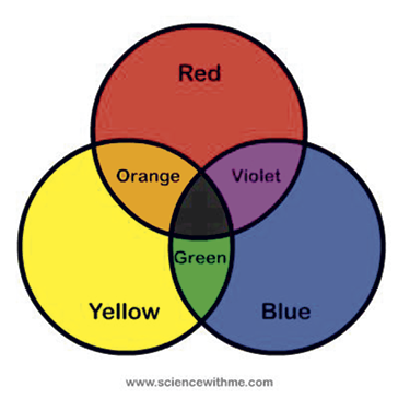
The easiest way to explain if a color is warm or cool is by breaking it down and determining if it has more red or more blue in it. Let’s start with a basic primary color wheel composed of red, blue and yellow. As red cools down toward blue it becomes purple. Yellow cools down as it moves closer to blue and turns green. Yellow warms up when it moves closer to red and becomes orange. Blue warms up as it moves toward red or yellow.
Now where does brown fit in? Brown is what most of us use on a regular basis. Rarely do any of us have clients that want vivid yellow or blue floors. Everyone wants a variation of brown or gray, right? I’ll focus on brown for now and we’ll touch on gray another day.
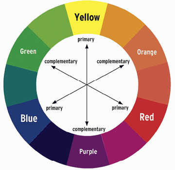
Let’s get back to the color wheel. The three primary colors are red, blue and yellow. The secondary colors are mixtures of these to form purple, green and orange. Complementary colors are primary colors and secondary colors positioned opposite each other on the wheel, such as blue and orange, red and green, or yellow and purple. When you mix complementary colors together, you get a muddy middle color — brown.
The best thing about knowing how to make brown is that you can make a custom brown out of almost any surplus colors you have: blue and orange, yellow and purple, red and green. If you need consistency over a large area, then a factory color out of the bottle is the best.
Black is not just black
Let’s look at browns as they pertain to acid stains and coloring and not get into the chemistry. Most of us know each pour of concrete takes acid stain differently. My favorite of all acid stains, black.
Black is not just black. When used full strength, it’s a warm black. When diluted, it becomes a cooler brown. Think about that for a second. A warm black acid stain dilutes into a cooler brown. It’s one of acid stain’s attributes you need to remember when using it. Any other type of black stain would appear gray when diluted.
 Since acid stains chemically react, the results differ from surface to surface. When you dilute a dye or a water-based stain, you just get less of the same color.
Look at figure 1. The entire driveway in figure 1 is coated with black acid stain. The border is a warm black, and the rest is a very cool brown. If the border had more blue in the black, it would be a cool black. Instead it has a hint of green to it, not red. Green is warmer than blue but cooler than red.
An easy way to think about warm and cool colors is to associate things to those colors. Cool blue water and green grass in contrast to the warmth of the sun or the heat of a red and orange flame.
This conversation is based on colors in relation to each other. Refer to the color wheel. Think about all the different color combinations brown can have based on how close it is to blue, red or green. In this image, it’s about how much closer each color is to red or green, not blue. Then add how the value of each one affects the overall look of the space.
Color relations
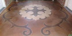
Now look at figure 2. I used a brown for the inside color and black for the border. The color in the main field — which has more red in it — is warmer than the border but both areas have a brown look. Value doesn’t always affect the temperature of the color, but in this case the darker color is the cooler one.
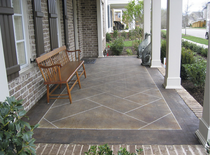
Figure 2 is about color relation. That border is almost black. In fact, it’s a slightly diluted black acid stain. That border has a cool brown, warm black feel to it. There is no blue in it. If there was a hint of blue it would be very cool in relation to the warmer brown used as the main color. The main color has more red in it.
When I’m talking with a client about what brown they have in mind, I’m trying to determine how much red or green should go into the brown. The more red, the warmer the brown. The more green, the cooler it is. Understanding this makes it much easier to adjust or fix a color that is too warm or cool.
Simply add its complement into the mix.
Am I getting warm?
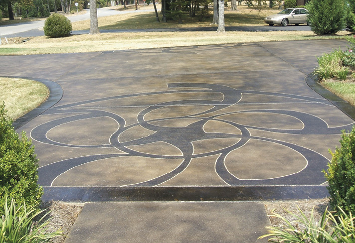
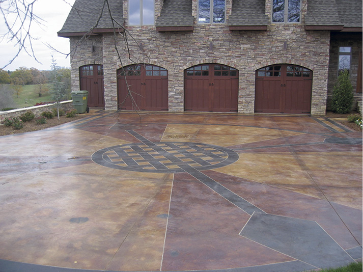
Look at figure 3. This driveway has three major color areas. The borders and interwoven designs are a warm black. Some of the triangle-shaped areas are a very warm reddish-brown, while the other areas are more of a tan. The reddish-brown and tan areas are the same acid stain.
The reddish-brown is warmer than the lighter tan. Again, this is the crazy thing about acid stain. At full strength the stain is warmer and created the reddish-brown hue. As it was diluted, it lightened up and slightly cooled to create the tan.
When I’m talking about color, this is where I sometimes confuse myself. In figure 3 the borders are a warm black, but they are cooler than the reddish-brown and tan. Everything about color is in relation to the other colors and values around it. We saw the same effect in figure 2 where the border was a cool brown with hints of a warm black. The black is still cooler than the warm brown.
Pay attention to the color choices you make with your client. Are they colder or warmer than the walls or brick? Are they darker or lighter than the walls or brick? There is no perfect answer. It is more about being aware of all the choices you have and why you are choosing them.
As the contractor/designer, you should understand color relationships and the warm and cool attributes of color. You should also be able to communicate this to your client. You should know how to create a custom brown from complementary colors and how to fine-tune a factory color to meet your client’s needs. Finally, you should be able to analyze the color qualities of adjacent materials and their relationships to one another so you can make good design choices that will create spatial harmony.